Packaging has long been designed for roughly three seconds: the reach, the grab, the drop into the basket. In that window, louder usually won. Saturated colour, a bold claim and a hint of urgency could settle a purchase before the shopper had finished reading the label.
That window is narrowing as a measure of what a pack must do. Health and beauty are increasingly bought through quick commerce and then lived with in public, in morning routines, shelfies and restock videos filmed at the bathroom counter. A pack that shouts can win a second on a shelf. On a counter, two months later, it has said everything it had to say and keeps saying it. It sits there, a little out of place, in a home where someone is trying to present a calm life.
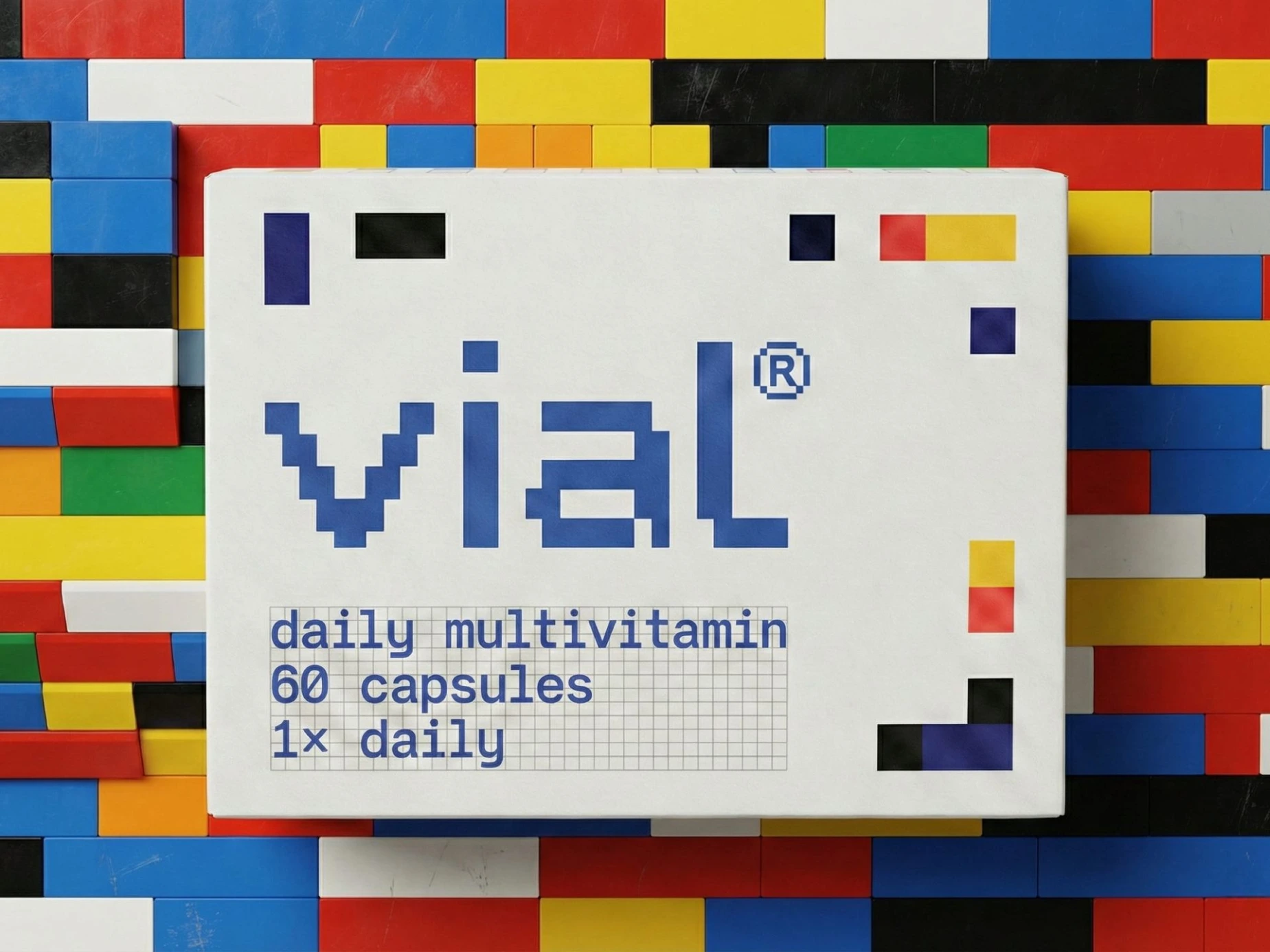
This is the problem Presentable, an independent design studio in Gurugram, set itself with vial, a daily multivitamin identity and packaging system. The brief the studio gave itself was less “how do we stand out?” than “what is still sensible on the fiftieth day?”
The grammar of the pharmacy
Supplement packaging has a recognisable grammar. Clinical typography signals authority, saturated palettes signal potency, and efficacy claims and urgent phrasing do the persuading. Taken together, these codes frame the product as a response to something wrong. You reach for it when there is a deficiency to correct, and you stop when the worry fades.
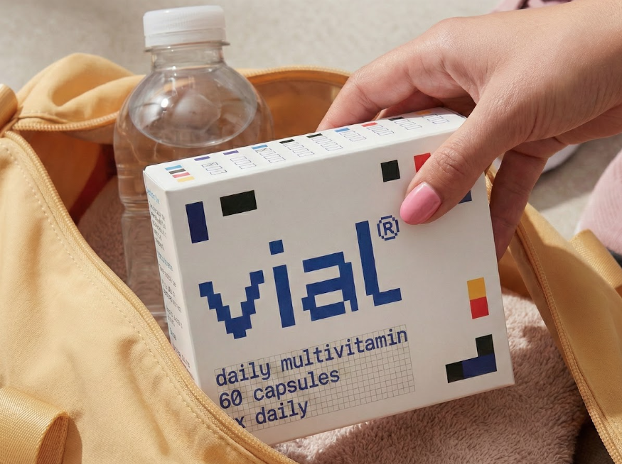
That framing has consequences beyond aesthetics. It encourages episodic use tied to perceived lack, and a reactive model of health in which consumption begins and ends with the problem. vial’s premise is the opposite: wellbeing is something you maintain, not something you fix. The design question follows from that. What does a pack look like when it is built for routine rather than rescue?
Order in place of urgency
Presentable’s answer is a single rational modular grid, applied to everything: composition, colour, typography and the logotype itself. Each geometric unit stands for one nutrient, distinct but always part of a larger whole. The visual argument is that health is cumulative and interdependent, not singular or dramatic.
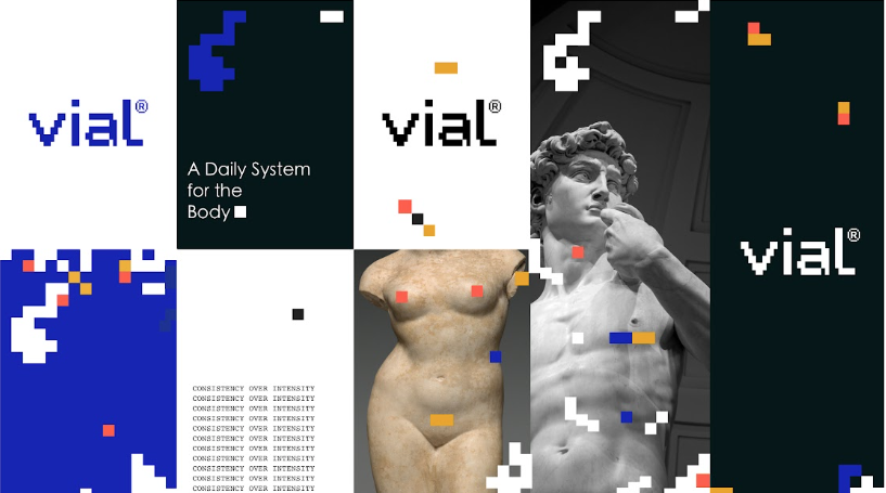
The references are deliberately plain. Mondrian supplies the compositional clarity, the sense that a few rectangles can carry real tension. Tetris supplies the stacking logic. Blocks align, stack and occasionally fall away, which the studio reads as absorption and shifting need, a reminder that wellbeing is not a fixed end state but something continuously adjusting.
Colour is handled with similar discipline. Rather than persuading, it informs: each hue marks a specific nutrient, so differentiation is built into the system while the palette stays restrained enough to hold together. Typography is neutral and controlled, doing the work of hierarchy and legibility without competing with the geometry.
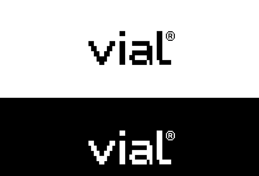
The most telling decision may be the logotype. Because it is generated from the same grid as the packaging, the mark is not a badge applied to a structure but a product of it. Mark and object share one logic, which is harder to achieve than it sounds and easy to spot when it is missing.
There is also a quiet tension built into the forms. Solid blocks convey stability and nutritional integrity, while irregular edges and deliberate gaps introduce the variation of a body whose needs change. Precision and adaptability sit side by side. The system is rigorous without pretending that people are.
A box with a job to do
Where vial moves from identity into behaviour is the checkbox. Printed into the box, the boxes let users mark each day’s dose directly on the pack. A passive container becomes a small interface, and the routine becomes visible without an app, a notification or a streak counter.
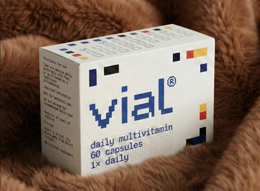
The mechanism is modest, and that is the point. Adherence is encouraged through gentle reinforcement rather than motivational pressure: a row of ticks gradually fills in, and the progress becomes part of the visual language itself. Trust, in the studio’s framing, comes from clarity and transparency rather than intensity.
It also suits the way packs now circulate. An object that is handled every morning, holds up on camera as part of someone’s routine, and can be explained in a sentence (“each colour is a nutrient, the blocks add up to a whole”) gives people something to talk about that is not a promise.
An older lineage
It would be easy to file this under imported Scandinavian-style minimalism. The project’s own account resists that. In 1957 the Government of India invited Charles and Ray Eames to advise on design in the country, amid concern about the declining quality of consumer goods. Their 1958 report argued for an attitude in which every quality serves a purpose, and illustrated it most famously with the lota, the everyday vessel refined by generations of use. The report also helped seed the National Institute of Design.

Presentable treats this as an inheritance rather than a borrowing: purpose-led design as a method with Indian roots, applied here to a contemporary consumer object. The lota makes a useful test case. Nothing about it is decorative, and yet it is not austere. It is simply resolved. vial’s closing claim echoes that: every element on the pack earns its place, and every element can explain why it is there.
The wider shift
None of this exists in isolation. In beauty, The Ordinary traded transformation narratives for ingredient transparency and disciplined routine, and in doing so changed what a restrained, information-led pack could signal. Supplements, on the whole, have been slower to follow, still leaning on clinical authority or aspirational lifestyle cues. vial applies the same logic to daily nutrition: restraint over persuasion, maintenance over emergency.
A fair caveat is that a pack cannot build a habit on its own, and a checkbox is only as useful as the person willing to tick it. Quietness also carries its own risk, since a design that refuses to compete for attention must be confident that attention is no longer the only currency. The test the project sets itself, whether the box still makes sense as a conscious choice on day fifty, can only be answered in use, over time.
Logic, not volume
What makes vial worth looking at is less its minimalism than its accountability. Quiet, examined closely, turns out to be logic: a system in which colour means something, the logotype follows the layout, and the layout follows an idea about health. Structure becomes the primary expression of care, balance the visual metaphor for wellbeing, and consistency its design language.
As more categories move from the glance to the long haul, that may be the more useful question for packaging to ask. Not how loudly a product can speak for three seconds, but how much sense it still makes after fifty mornings on the counter.